Welcome!

Welcome to my blog. Over the years that I have been stamping and paper crafting, I have so often been inspired by the ideas on other sites and blogs. I hope I can pay that back in some measure with my own. (In between laughs -- or cackles as my son calls it!)
Showing posts with label Sheena Douglass. Show all posts

August 31, 2014

End of Summer Sunflowers

This card is for my friend Hiroe's birthday.  Sunflowers always seem to be a transitional flower, between late summer and early fall.  It uses a variety of techniques:

  • The mottled green and beige background is one of my altered NatGeo pages.
  • The sunflower is a napkin design, decoupaged directly to the background.
  • The sentiment is from SU's 'Art of Life' set, stamped on to tissue paper and then adhered with ModPodge.  I chose this sentiment for Hiroe because her sweet, sunny disposition always brightens our day!
  • The swirls are by Sheena Douglass (from Crafter's Companion) and are heat embossed with SU olive green embossing powder.
  • I added some brown micro beads (by Martha Stewart) in to the center of the flower.
  • This is then matted on a mustard cardstock, then on to a moss green 5x7" card base.

I love bringing together many different techniques on to one card.

December 23, 2012

Looking back at a year of Crafter's Companion designs

Hello!  As we near the end of 2012, I wanted to take a look back at the designs I had done as part of my year on the Crafter's Companion Design Team.

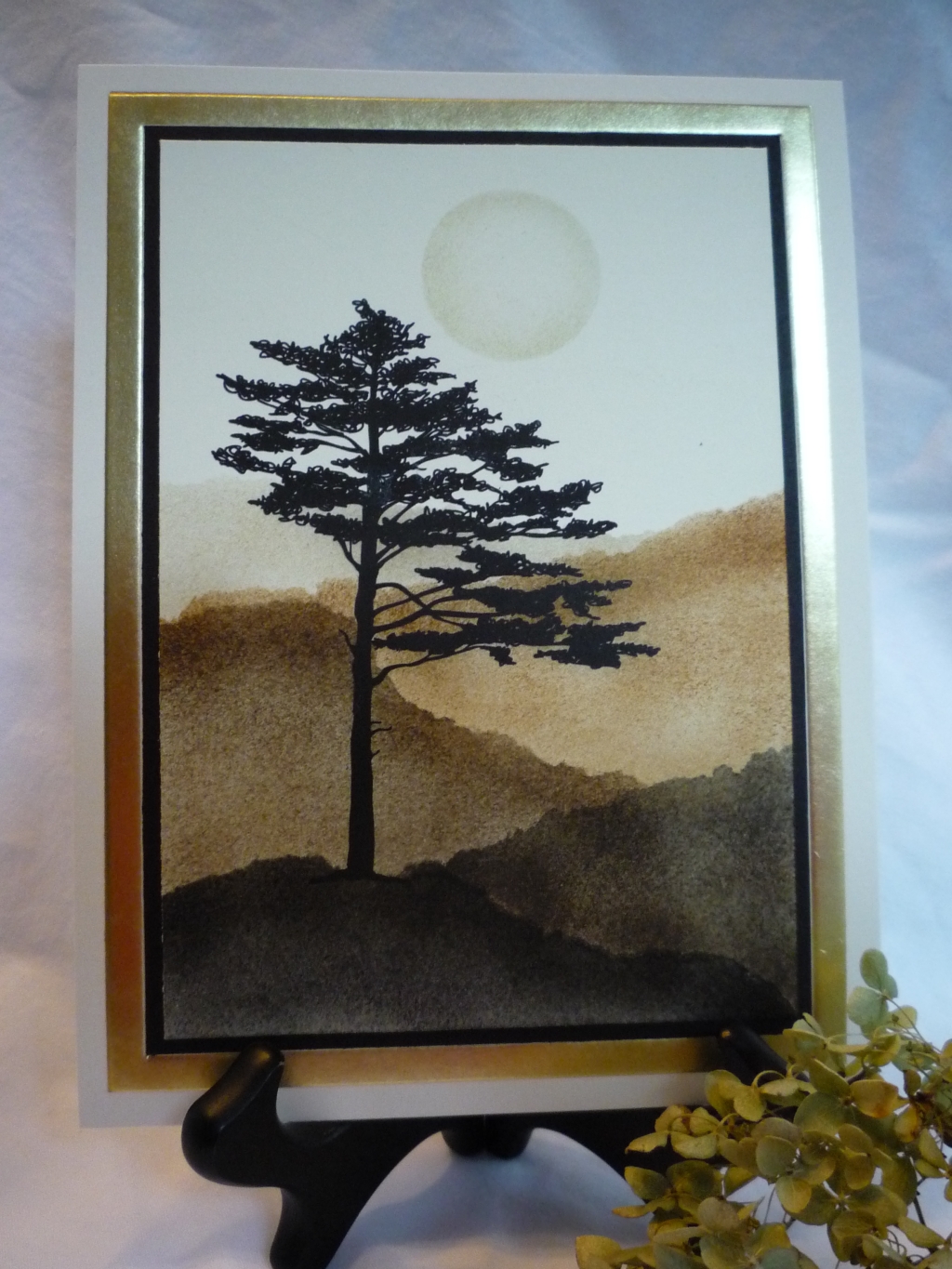
We were asked to pick one of our favorite posts to highlight.  I think the card below, with the stippled rolling hills in earthy colors, and that beautiful asymmetrical pine is it.  Why?  Well, first the image is dramatic and striking, and perfect for heat embossing.  And, the stippling technique is so easy and gives a real wow factor.  Third, this is one of my favorite color palettes.  And finally, it can be used for any gender - and sometimes I struggle with masculine cards.


So here's for a second look at my Pine Tree and Misty Hills card, originally posted in September.  The image is from Sheena's Pinescape set.

The Design Team coordinators also picked their favorite post of mine from this year.  Curious as to which one they picked?  See it here.  Coincidentally, it was made with another one of Sheena's sets.  And, if you click on the "here", and leave a comment and follow the other instructions, you'll have a chance to win my favorite stamp set -- Sheena's Silhouette Grasses.  Notice a trend?  I love Sheena's designs!

I'll be leaving the design team at the end of December.  It has been great getting to use the wonderful designs and products from Crafter's Companion.  I'll miss it, but I know the new design team members will be awesome!

December 16, 2012

Serene Honey Locust Leaf

OK, so I don't know if this image is really a honey locust or not...it actually reminds me of a fern...but I love it.  It is from Sheena's A Little Bit Sketchy Autumn Leaves set.


I needed to make a masculine birthday card for a co-worker, and this image worked marvelously.  I started with confetti tan card stock, and embossed the image in white embossing powder using Versamark ink.  This was die cut in an oval, with a white scalloped oval mat, and set aside.

Next I did the background.  I used Versamark ink and clear embossing powder on the tan card stock.  It gives a nice subtle raised watermark or tone-on-tone look.  This was layered on to a white mat, and then on to a folded A2 tan card base.

I adhered the oval image just a bit higher than center.  The Happy Birthday image is raised and adds nice dimension.  It is from the Beatrix Potter Two Bad Mice "Appley Dapply" 3D Toppers.  The color coordinated beautifully.

As a finishing touched I wrapped some thin twine (from the hardware store, LOL) around the spine.  I tied on two coordinating beads.  Since I'm handing it to the recipient at work, I didn't have to worry about the added bulk of the beads for mailing.

Twenty minutes from start to finish -- you can't beat that!  Hope you enjoyed it.

December 2, 2012

Elegant Snowflakes

The winter cold becomes a bit more bearable when you can sit in your craft room, all cozy in your jammies, and play with the Ornate Snowflakes set by Sheena Douglass.  I decided to go outside the traditional color spectrum for snowflakes and do an elegant card in black and gold.


I started by embossing the snowflake on to black card stock.  I used a mixture of gold and silver metals.  That was a happy accident when I made this card -- I accidentally mixed gold and silver and poured it back in the bottle -- polluting the entire jar of powder.  I was going to throw it away, but at heart I am frugal, so I tried it -- it looks really cool mixed!   This main image was then die cut in a circle and matted on to a larger brushed gold circle.

The background is simply black card stock embossed in a medallion design.  I tied a big bow in sheer gold organza ribbon about an inch from the bottom.  Then I adhered the focal image with dimensionals.  This was layered on to an A2 card base of brushed gold.

This was so quick to make that I made a small matching tag.

This card is intended for my manager's birthday -- hope she likes it!

November 25, 2012

Autumn Maple Leaf

I think this Autumn Leaves set by Sheena Douglass is my new favorite set.  I'm sorry to see autumn end and with it occasions to use it.  It is really versatile -- I even used it on a wedding card!

I started by using a few brayered backgrounds in autumn tones that I had dome in a big batch a few weeks ago.  I spritzed them with stamp cleaner (yes, stamp cleaner!) and got the water drop look.  You can do this even if the backgrounds have dried for several days.

On one, I heat embossed the maple leaf with copper embossing powder.  This was trimmed and layered on to an olive green mat, and then on to a black mat.

The second background was layered on to a black mat.  The next step was to use three copper brads in the lower right.  (Tip:  use a paper piercer and hole template to keep the brads straight and evenly spaced.)  Finally this was mounted on to a rust A2 card base.

Simple - but striking.  Hope you enjoyed it!

November 14, 2012

Autumn Wedding


Here's an autumn wedding card that uses Sheena Douglass' Autumn Leaves set.  I kept the color scheme to ivory and metallic.


I started with a purchased card base that already had the trellis die cut on the right.  I then heat embossed in gold the fern-looking leaves in a right angle on the bottom left.  On scraps of SU Confetti Cream card stock, I heat embossed several leaves, some in gold and some in copper.  

Then I cut (and cut) out the leaves.  I arranged them in a spray radiating out from the bottom left corner.  A purchased paper rose anchors the corner.  Everything is adhered with glue dots.

I heat embossed the greeting (from the retired SU set, Elegant Greetings) in golds, and die cut it with my oval Nestabilities.  I layered this on to an oval mat of SU Brushed Gold card stock.

Finishing touches were tiny coppery-brown pearls at the intersection of the trellis.  Hope you enjoyed it!

November 11, 2012

Embossed Wildflowers

Hello!  Today I have a pair of embossed wildflower cards to share with you.  I really love silhouette stamps, because they are typically so easy to work with and give dramatic results in a short time.  The Silhouette Grasses set by Sheena Douglass is a perfect example.

I started with brayered backgrounds (which is another tip if you need a quick but dramatic card).  One I brayed in apricot and pink; the other in blue and greens on to a coated semi-gloss card stock..

Next I stamped the sentiments in black.  I did the sentiments first; that way if they turned out crooked I didn't waste a lot of time!

Then, I shadow stamped the wildflowers - one in a pinkish-plum and the other in turquoise.   When that dried (give a little extra time on coated card stock), I stamped the wildflowers a bit lower down with Versamark ink, and sprinkled with silver embossing powder.  Use your heat tool to melt it.  The shadow effect is an easy way to add depth.

I'll let you in on le booboo that I made.  I accidentally sprinkled some gold powder on to the turquoise card. I decided I liked it and went with the flow.  In fact if I did it again, I would be more liberal with an intentional mixed metal look!

I finished the cards simply with a black mat and then mounted them on to coordinating folded A2 card bases.  Enjoy!

November 4, 2012

Snowflake bookmarks

Here are three bookmarks that I made with Sheena's A Little Bit Scenic Ornate Snowflakes set.  Sometimes I like to give people tags or bookmarks instead of a traditional Christmas card - and these are sized to slip in to a legal sized envelope along with my annual Christmas letter.


These were quick and easy, and done with emboss resist.  I started with white coated card stock (use glossy or semi-gloss to help the ink blend when stippling).  Then, using Versamark ink and clear embossing powder, stamp your snowflakes and the swirl design up and down the bookmark.  Avoid going in a straight line, and try to have some go off the edges.  Use your heat tool to melt the embossing powder.

Your next step is to use any water-based dye ink and a stipple brush and stipple color around the snowflakes, going from dark to light as you work outwards.  I used two coordinating colors on each, for example, pink and lavender  red and rose; light blue and darker blue.  Be sure and leave some white space as contrast. Then take a tissue and wipe excess ink off of the embossed snowflakes, revealing the white underneath.  That's the resist part.

Finishing touches were to round the corners and thread ribbon and fibers of your choice.

Try it -- these are surprisingly quick and easy!  These would be equally as pretty done for Spring with Sheena's Silhouette Grasses set that has those gorgeous wildflowers.

October 31, 2012

Peaceful Wildflowers

Today I'm sharing a soft, peaceful card that I made with Sheena's A Little Bit Scenic Silhouette Grasses. I used it as a sympathy card for a coworker who had recently lost her grandmother.  This design gave me just the serene feeling I was looking for.


I pulled out my brayer again and used different shades of green on coated card stock.  After the ink dried, I used the large wildflower image and heat embossed it in white.  I layered this on to an embossed white mat, and then on to a folded A2 moss green card base.

I added a sympathy greeting from my collection; punched with an oval and matted it on a scalloped oval.  This was adhered with dimensionals.  The final touch was narrow white ribbon tied along the fold.

October 28, 2012

Wildflower Sunrise


Today I'm sharing a sunrise wildflower card that I made with Sheena's A Little Bit Scenic Silhouette Grasses.


I started by brayering in shades of pale yellow and apricot on coated card stock.  (How long has it been since you dusted off your brayer?  It is great for quick, easy backgrounds.) After the ink dried, I used the large wildflower image and heat embossed it in black.  I layered this on to a black mat, and then on to a folded A2 apricot card base.


The greeting is from the Mulberry Woods Friend set.  I thought that it went with the wildflower image perfectly.  I stamped it, then scanned it to reduce the font to fit better in to my design layout.  I love it when I can mix and match sets like that!  Then I oval-punched it, and sponged lightly before layering on a pale yellow oval scalloped mat.

The punched butterflies were added as a finishing touch to add some motion and dimension.  Can you see that the large butterfly was punched from a scrap of polished stone paper?  A few rhinestones and they were done.  Tip:  when adding accents like this, usually odd numbers work best, unless your design is formal and symmetrical.

Hope you enjoyed it!

October 14, 2012

Autumn Leaves

Today I'd like to share with you a card made with Sheena Douglass' Paint Fusion "Ivy" set.

I started by heat embossing the ivy spray in black on to confetti cream card stock.  Then, I heat embossed two extra large leaves and two extra small leaves.

To color, I misted the leaves very lightly with water, and then applied ink with a watercolor brush.  I kept the palette mainly to autumnal tones of oranges, rusts, and red.  When dry, I cut out the extra leaves.  I used gold Smooch to add some shiny highlights.  Once colored, I think the leaves look like autumn maple leaves, not ivy.  I love versatility like that in a set!

The greeting is from another great set from Sheena, "Milestones and Moments".  I used a circle die cut to cut the greeting, dry emboss it, and layer it on to a larger black circle.  This was then glued to the card front to the right of the ivy spray.  I then layered this on to a rust mat, and then on to a cream A2 top-folded card base.

The final touch was positioning the extra cut out leaves with dimensionals.  Be sure to overlap the leaves on to the greeting circle for cohesion.  I am really pleased with how it turned out; it was fairly quick and easy; and it's the perfect autumn card for any number of occasions.


October 7, 2012

Distressed Destination

I loved this Destination image from Sheena's A Little Bit Sketchy line ever since I saw the beautiful cards that stampin' sister and fellow design team member Trena was making with it this summer. To make it my own, I did heavier distressing and added twine and beads.


A little back story.  I have a colleague, Kate, at work who has been working on a major project for about 18 months.  Tonight, we deploy.  (In fact I'm writing this as we wait at 2:00 am for the OK from IT to go in and test it and give the final green light.)  Throughout the whole time, she kept focus despite all the windstorms that threatened to throw the project ship off course.  I thought this card was destined for her.


First I stamped the image in black on to white card stock.  I used walnut ink (you dissolve the crystals in water; more water gives a less intense brown) to heavily sponge the edges.  Since it is a liquid, it tends to soak in and spread, giving a more saturated, vintage feel.  I then used my Spectrum Noir alcohol markers to shade pale grey on the sails, and tan on the land where the walnut stain hadn't hit.  A touch of grey-blue defined the ocean shore.

I distressed the edges and layered it on to a white mat, also distressed.  Because the walnut ink was so dark, I wanted the white for a bright contrast. This was then mounted on a side-fold A2 tan card base.

To finish it off, I added twine around the left fold, and beads, including some rolled paper beads that I made from scraps cut into long thin triangle shapes.  (Yes, I save my scraps, LOL).  I frayed the edges of the twine, and it was done!


September 23, 2012

Pine Tree and Watercolor Sky

Can I tell you how much I love this asymmetrical pine tree image from Sheena Douglass' Pinescapes set?  It is bold, yet has enough open space to let backgrounds shine through.  Plus, it can really stand on its own for clean and simple cards.


I started with watercolor paper, and spritzed it with water to get it wet.  I then used an aqua pen and reinker drops to add the colors, working from the bottom up with tan, green, lavender, pink and blue. 

If your colors aren't "runny" enough, squeeze the aqua pen for more water; if too runny you may need to blot it.  My paper was pretty soggy when I was done.  I let it dry overnight.


The next step was to use Versamark ink and black embossing powder and heat emboss the pine tree image.

Then, this was layered on to a black mat and then on to a folded A2 moss green card base.

That's it!  No ribbon, no embellishments, no glitter (ack!).  Just let the image and the colors in the background do the talking.  When I know what occasion it'll be used for, I'll probably add a small greeting in the bottom right corner.

September 16, 2012

Patchwork Snowman

Remember last week I did a quilted background for my stocking buddies card?  Well, I had so much fun with the quilting that I decided to use that technique again this week.  Except for this card, which uses Sheena's A Little Bit Festive "Happy Snowman" set, the quilt is the sky.

I started by making the quilted sky.  I chose various shades of blue, and used a 3/4 inch punch so that I could get smaller squares for more variation in design.  There's no discernible pattern here, just lots of blue paper arranged somewhat randomly.  I trimmed the quilt layer down and mounted it on a black mat, which then was layered on to a folded A2 card base in a saffron yellow.

Next, I stamped the snowman image in black ink onto white card stock, and colored it with my Spectrum Noir alcohol markers.  I stamped the 'Let it Snow' greeting along the bottom.  Then, I cut out the image and liberally applied fine glitter to the rooftops and the snowman.  I love winter scenes, they are a perfect excuse for glitter.  :-)

I was going to glue it on top of the quilted sky.  But it didn't look right, the image faded away with the busy-ness of the quilt.  Hmmmm, what to do for a rescue?

What the card needed was  a visual separation of sorts.  I dug out some white mulberry paper and did a guided tear along the line of the rooftops and the snowman.  Much better!  I mounted this with dimensionals for a bit of a 3D effect.

Final touches were small black dew drops for the buttons and eyes, and blue dew drops that are supposed to be snowflakes, in the sky.  Here's a closer look.

Hope you enjoyed it!  Have you started your Christmas cards yet?

September 2, 2012

Pine Tree and Misty Hills

Sometimes you see a stamp image and you know exactly how you are going to use it.  When I saw this great asymmetrical pine tree from Sheena's A Little Bit Scenic Pinescapes set, I knew I was going to make a hilly background.  You see, at my old job, there was a conference room that maybe twenty years ago was an executive conference room, but over the years had turned in to an "anybody can reserve it" room.  The decor was dated from its glory days in the 80's, but I always loved a fiber wall hanging of misty layered hills that was on the wall.  Time after time I said to myself, "That would make a great card!".  Well, I've since retired from there and now work at another company (yup, I know -- a very short lived retirement), but finally I used the inspiration from the fiber wall hanging to make a card.  And I am just thrilled with the result!

This is nothing more than using torn paper as a mask and stippling color on.  (You could also sponge -- it would be faster but I think you get less control and I usually get those pesky fingernail blotches when I sponge.)  The tip is to use the darkest color in the foreground and gradually lighten it with each successive layer of hill in the background. 

I used mostly Tim Holtz' Distress inks, and used black soot in the foreground, but not so very black as to obliterate the black pine tree, and then faded through shades of brown (walnut stain and vintage photo).  Another tip is to use clean torn paper for each layer, so you don't get stray ink residue.  I tell you this because that happened to me.  A gum eraser removed most of it -- can you find the spot? ;-) .  I did a reverse circle mask for the moon with a post it note, and used the lightest ink color (Stampin' Up's River Rock) and a smaller stipple brush to darken the edges so you get the illusion of the moon.

It was matted on to a black layer, and then on to a 6x8 invitation card with a gold band (a no-fold panel).  I think they are really meant for do-it-yourself wedding invitations but it worked great for this.  I added absolutely no embellishment, not even glitter on the moon.  It was hard to restrain myself, but I wanted it to be stark and unadorned, like the pine image itself.

A torn paper mask is one of the simplest techniques, and can give great results.  Enjoy!

August 12, 2012

Country Lane

Love, love, love this set by Sheena Douglass.  It's called Milestones and Moments.   I was inspired by this great card that my stampin' sister Trena had made for me when I retired in January.  It was a short-lived retirement; I'm back at work with a new company, and I needed a card for a colleague who was moving to a new job and this image seemed perfect.

I stamped in Versamark ink on confetti cream paper, and used detail black embossing powder.  I chose the off-white color to match the lattice-edged card base.  (Yes, sometimes I do think ahead, LOL!)  I used my watercolor crayons because this scenic image was just asking for a soft, flowing touch.  I like to emboss the image when I watercolor, because it creates little raised edges that keep the colors from bleeding too much.  When I use the water color crayons, I color along the edges and draw the pigment inward with a wet brush.  This gives you gradation of color without over-thinking it.  When you do trees, be sure to mix the greens for a more realistic look.

I layered the image on to a black mat, and adhered this to the card base.  I stamped the greeting in black and used a large oval punch and attached it with dimensionals.

For a finishing touch, I put tiny black rhinestones on the greeting and at the intersection of the lattice.

Hope it inspires you to try water coloring an image.

July 29, 2012

Sunset Scenes

I am loving these new "A Little Bit Scenic" stamps by Sheena Douglass.  Today I'm using both her new Silhouette Grasses and Silhouette Highlands sets.  I really love bold images -- they let me go crazy with the backgrounds!

I decided to dig out my pastel chalks which were getting a bit dusty.  I've been neglecting them since I discovered Spectrum Noir markers but I love the soft look that chalks give, so they got some long overdue love on this card.  I used yellows, oranges, reds and a hint of burgundy, from light to dark, and blended with a cotton ball.  Fast with dramatic results, and even faster when you do two similar designs at the same time!  The only drawback to chalks is that you get very messy fingers, so be sure to wash your hands between steps so you don't get smudgy fingerprints where you don't want them.


I added a glittery moon by 'painting' a circle with glue and then using yellow glitter. After drying, this was layered on to a black mat, and then I added a die cut corner element with a yellow rhinestone.  This then went on to a folded apricot card base for the island scene, and on to a burgundy folded card base for the wildflowers.


It really could not be easier than that!  (Which is probably another reason I love bold images, LOL!)

Hope you are inspired to make your own sunset cards!

June 18, 2012

Tea and Polka Dots

Isn't this French 50's Cafe set from Sheena Douglass fun?  Today I decided to use only a small stamp from the set, the little polka dotted tea cup, and design my card around it.

This card uses the basic design principle of repetition. I find that repetition is a great way to get more use out of my smaller images. The circle theme is repeated throughout, and of course was inspired by the dots on the teacup. Let's see how many times circles were repeated:
  • The teacups have polka dots
  • The three images were punched with a 1 inch circle punch
  • The images were then layered on 1 1/.4 inch black circles
  • The background paper has polka dots
  • The rose-red strip has punched circles (3/4, 1/2 and 1/4 inches) layered in tone-on-tone fashion.  Tip:  this is a very cheap and quick way to add subtle dimension to your cards.
  • I used red 'rain dots' scattered across the front and on the 'j' in the greeting. These add a glistening look in real life.

I think its a fun, cheerful card that is sure to brighten someone's day! Try using repetition on one of your card creations soon!

May 27, 2012

Provence Altered Box

I have an altered box for you today, using a beautiful image from Sheena Douglass' Provence collection.  I've shared before how I have a large pile of empty jewelry boxes, and I decided to dig into that pile for today's project.
This little box will either be used to 'wrap' a gift card for a house-warming gift -- or with the 'home' image, I might use it to store the keys that my neighbors give me when they ask me to check their mail or feed their cats while out of town.  Currently I throw the keys into a mug in the kitchen cupboard.  How much more charming this would be!


First, I started by stamping the image in black on to white card stock.  I colored it with my Spectrum Noir markers, and sponged the edges in a mossy green ink.

I adhered the image to the box lid.  Next, I wrapped ivory ribbon around the lid, followed by a sheer turqouise polka dot ribbon which I tied in to a bow.  All that was left to do was to punch leaves out of several shades of green, and glue the leaves to the opposite corners of the box lid.  The final touch was to glue small paper flowers in the corners.  I used my Spectrum Noir markers to tint the flowers a deep pink.

Hope you enjoyed this little box! 

April 8, 2012

Oh my, Oh Duck!

I had to laugh out loud when I saw this Oh Duck! image from Sheena Douglass.  It reminded me of a time when my boys were little, and we were walking in Fullersburg Woods, a local park.  Well, we saw a duck trapped in the ice exactly in this position.  I remember thinking, "What a predicament, you think you're going for a snack and look what happens!" Every time I see a duck in that position, even now twenty years later, I silently encourage them to hurry up and get upright again before winter comes. So of course, I had to use this one.


The beauty of this card is how quickly it went together.  Truly the image says it all! Wouldn't it be perfect for someone who had a hard day at the office or who is having some of life's little annoyances?

After coloring with my Spectrum Noir markers, I matted it on black and than mounted it onto a celery green card base.

I added a few rain dots because I felt guilty only spending 5 minutes on a card, LOL!  


And then she was done. If you have a quirky sense of humor, be sure to check out Sheena's new designs! Hope the rest of your Sunday is happy, and that you are enjoying your Easter!