Remember last week I did a quilted background for my stocking buddies card? Well, I had so much fun with the quilting that I decided to use that technique again this week. Except for this card, which uses Sheena's A Little Bit Festive "Happy Snowman" set, the quilt is the sky.
I started by making the quilted sky. I chose various shades of blue, and used a 3/4 inch punch so that I could get smaller squares for more variation in design. There's no discernible pattern here, just lots of blue paper arranged somewhat randomly. I trimmed the quilt layer down and mounted it on a black mat, which then was layered on to a folded A2 card base in a saffron yellow.
Next, I stamped the snowman image in black ink onto white card stock, and colored it with my Spectrum Noir alcohol markers. I stamped the 'Let it Snow' greeting along the bottom. Then, I cut out the image and liberally applied fine glitter to the rooftops and the snowman. I love winter scenes, they are a perfect excuse for glitter. :-)
I was going to glue it on top of the quilted sky. But it didn't look right, the image faded away with the busy-ness of the quilt. Hmmmm, what to do for a rescue?
What the card needed was a visual separation of sorts. I dug out some white mulberry paper and did a guided tear along the line of the rooftops and the snowman. Much better! I mounted this with dimensionals for a bit of a 3D effect.
Final touches were small black dew drops for the buttons and eyes, and blue dew drops that are supposed to be snowflakes, in the sky. Here's a closer look.
Hope you enjoyed it! Have you started your Christmas cards yet?
We stamp. We talk. We laugh. But my son says we are the "cackling stamping ladies"!
Welcome!
Welcome to my blog. Over the years that I have been stamping and paper crafting, I have so often been inspired by the ideas on other sites and blogs. I hope I can pay that back in some measure with my own. (In between laughs -- or cackles as my son calls it!)
September 16, 2012
September 9, 2012
Quilted Stocking Buddies
You know how sometimes the image itself dictates the design? That's what happened with me and the "Waiting for Santa" stocking image from the new Strawberry Kisses Christmas line. The stocking looked quilted and homespun, so I decided to go with a quilted background and carry that feeling throughout the card.
Quilted backgrounds are nothing more than pieced paper, and are a lot of fun to do. Also they are great to use up paper scraps, or paper that is a little bit out of style. Years ago I had bought a huge slab of Christmas designer paper and still had most of it left. So I dug in and punched one inch squares from four coordinating papers. The plus side is that it makes you feel very virtuous to be using up those old supplies! (Tip: you can cut the squares on your cutter, but it sure is faster and more consistent to use a square punch.)
You can Google quilt designs for pattern ideas. This one is fairly simple, using squares and triangles. Time saving tip -- you really only have to "quilt" the edges because the middle usually gets covered up. A mixture of patterns and solids usually works well. I ran the solid squares through my trusty Swiss Dot embossing folder for texture. Then just start gluing down on the mat layer (in my case burgundy), starting 1/8" away from both corner edges and working square to square The quilted layer was then adhered to a 5.5 inch top folded white card base.
Final touches were applying tulip snow for the fur on the stocking, and faux-sewing 4 buttons and using glue dots to adhere -- three in the upper left and one on the greeting (which I scanned and shrunk to fit my small oval punch). I deliberately used white buttons and white thread because although I wanted the homespun feel and added interest, I didn't want all those buttons to compete with the focal point or even the background.
I used a fifth coordinating designer paper to make the envelope. It is so easy to make custom-sized envelopes with the Envelobox Creator. For an envelope to fit my 5.5 inch square card, I started with an 8.25 square piece of paper and scored at row G on all sides. That was it! Another great way to whittle down that slab of paper, and it removes the reluctance that I used to have to make these large square cards, for fear that I didn't have an envelope to fit.
Hope you enjoyed today's card!
September 2, 2012
Pine Tree and Misty Hills
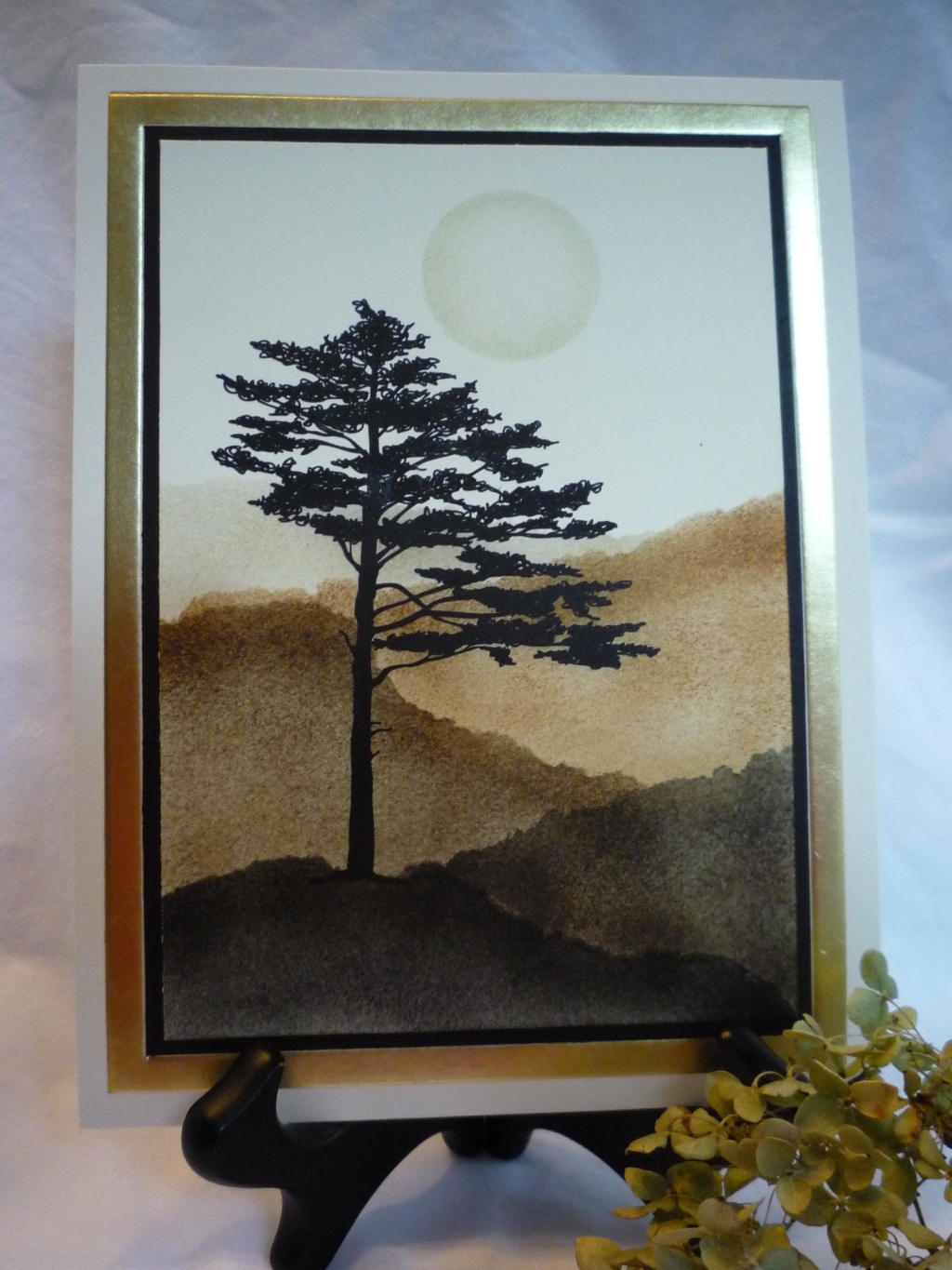
Sometimes you see a stamp image and you know exactly how you are going to use it. When I saw this great asymmetrical pine tree from Sheena's A Little Bit Scenic Pinescapes set, I knew I was going to make a hilly background. You see, at my old job, there was a conference room that maybe twenty years ago was an executive conference room, but over the years had turned in to an "anybody can reserve it" room. The decor was dated from its glory days in the 80's, but I always loved a fiber wall hanging of misty layered hills that was on the wall. Time after time I said to myself, "That would make a great card!". Well, I've since retired from there and now work at another company (yup, I know -- a very short lived retirement), but finally I used the inspiration from the fiber wall hanging to make a card. And I am just thrilled with the result!
This is nothing more than using torn paper as a mask and stippling color on. (You could also sponge -- it would be faster but I think you get less control and I usually get those pesky fingernail blotches when I sponge.) The tip is to use the darkest color in the foreground and gradually lighten it with each successive layer of hill in the background.
I used mostly Tim Holtz' Distress inks, and used black soot in the foreground, but not so very black as to obliterate the black pine tree, and then faded through shades of brown (walnut stain and vintage photo). Another tip is to use clean torn paper for each layer, so you don't get stray ink residue. I tell you this because that happened to me. A gum eraser removed most of it -- can you find the spot? ;-) . I did a reverse circle mask for the moon with a post it note, and used the lightest ink color (Stampin' Up's River Rock) and a smaller stipple brush to darken the edges so you get the illusion of the moon.
It was matted on to a black layer, and then on to a 6x8 invitation card with a gold band (a no-fold panel). I think they are really meant for do-it-yourself wedding invitations but it worked great for this. I added absolutely no embellishment, not even glitter on the moon. It was hard to restrain myself, but I wanted it to be stark and unadorned, like the pine image itself.
A torn paper mask is one of the simplest techniques, and can give great results. Enjoy!
This is nothing more than using torn paper as a mask and stippling color on. (You could also sponge -- it would be faster but I think you get less control and I usually get those pesky fingernail blotches when I sponge.) The tip is to use the darkest color in the foreground and gradually lighten it with each successive layer of hill in the background. I used mostly Tim Holtz' Distress inks, and used black soot in the foreground, but not so very black as to obliterate the black pine tree, and then faded through shades of brown (walnut stain and vintage photo). Another tip is to use clean torn paper for each layer, so you don't get stray ink residue. I tell you this because that happened to me. A gum eraser removed most of it -- can you find the spot? ;-) . I did a reverse circle mask for the moon with a post it note, and used the lightest ink color (Stampin' Up's River Rock) and a smaller stipple brush to darken the edges so you get the illusion of the moon.
It was matted on to a black layer, and then on to a 6x8 invitation card with a gold band (a no-fold panel). I think they are really meant for do-it-yourself wedding invitations but it worked great for this. I added absolutely no embellishment, not even glitter on the moon. It was hard to restrain myself, but I wanted it to be stark and unadorned, like the pine image itself.
A torn paper mask is one of the simplest techniques, and can give great results. Enjoy!
August 26, 2012
Cross-stitched Poppet
Isn't the new Paintbox Poppets Winter Collection by Christine Haworth too sweet? I really like the nostalgic feel to these images. Today I decided to use the Yuletide Logs set.
For a change, I picked out my background paper first. I had a big slab of Christmas paper and I decided to use it. So, I used my Spectrum Noir alcohol-ink markers to color the poppet's dress to coordinate in shades of moss, olive, rose red and pale blue. (You'll understand why I used blue when you see the envelope.) I used my oval die to cut and emboss, and then cut a scalloped oval from rose red for the layer.
Before adhering the layers, I hand-stitched with white embroidery floss. I did cross stitches along the left side of the oval; satin stitched the hat's pompom; and tied a little white bow on her vest. Use a piercing tool and a template for even stitches.
The stitched image was then adhered to the red scalloped layer. This went on to a dry embossed white layer (doesn't this embossing folder remind you of a knit Norwegian sweater?), then on to the patterned paper, then layered on olive, and finally on to a folded white card base.
Inside, I used coordinating paper and mounted the greeting on a moss scallop-punched oval. The final touch was a coordinating envelope made with the Envelobox Creator. It is so easy to make coordinating envelopes, and doesn't even take a full sheet of paper!
Hope you enjoyed today's card. Have you started your Christmas cards yet? ;-)
For a change, I picked out my background paper first. I had a big slab of Christmas paper and I decided to use it. So, I used my Spectrum Noir alcohol-ink markers to color the poppet's dress to coordinate in shades of moss, olive, rose red and pale blue. (You'll understand why I used blue when you see the envelope.) I used my oval die to cut and emboss, and then cut a scalloped oval from rose red for the layer.
Before adhering the layers, I hand-stitched with white embroidery floss. I did cross stitches along the left side of the oval; satin stitched the hat's pompom; and tied a little white bow on her vest. Use a piercing tool and a template for even stitches.
The stitched image was then adhered to the red scalloped layer. This went on to a dry embossed white layer (doesn't this embossing folder remind you of a knit Norwegian sweater?), then on to the patterned paper, then layered on olive, and finally on to a folded white card base.
Inside, I used coordinating paper and mounted the greeting on a moss scallop-punched oval. The final touch was a coordinating envelope made with the Envelobox Creator. It is so easy to make coordinating envelopes, and doesn't even take a full sheet of paper!
Hope you enjoyed today's card. Have you started your Christmas cards yet? ;-)
August 19, 2012
Winter Panda Bears
Today I have a card done with a new set, "Winter Wonderland", from the fun Christmas in Mulberry Wood line from Crafter's Companion.
I decided to make my bears Panda's, although what Pandas are doing in the snow, I'm not really sure. But in my craft room, imagination is allowed :-)
First, I stamped the image and greeting in black ink on to white card stock. Then I colored with my Spectrum Noir markers. I liked the way that fellow Design Team member Taylor colored the winter trees blue on her recent card here.
I layered the main umage on to black to draw out the black in the Pandas. I scalloped the edge of this layer and added an assortment of blue polka dot and black gingham ribbon. This was then layered onto blue patterned paper which I also punched with a fancier scallop. This went on to a top-folded white card base.
I decided to reprise the scallops a third time, on the bottom opening edge of the card. I added some rhinestone snowflakes and some tiny rhinestones under the bottom scallop flap and it was done!
Hope you enjoy it and have a happy Sunday!
I decided to make my bears Panda's, although what Pandas are doing in the snow, I'm not really sure. But in my craft room, imagination is allowed :-)
First, I stamped the image and greeting in black ink on to white card stock. Then I colored with my Spectrum Noir markers. I liked the way that fellow Design Team member Taylor colored the winter trees blue on her recent card here.
I layered the main umage on to black to draw out the black in the Pandas. I scalloped the edge of this layer and added an assortment of blue polka dot and black gingham ribbon. This was then layered onto blue patterned paper which I also punched with a fancier scallop. This went on to a top-folded white card base.
I decided to reprise the scallops a third time, on the bottom opening edge of the card. I added some rhinestone snowflakes and some tiny rhinestones under the bottom scallop flap and it was done!
Hope you enjoy it and have a happy Sunday!
August 12, 2012
Country Lane
Love, love, love this set by Sheena Douglass. It's called Milestones and Moments. I was inspired by this great card that my stampin' sister Trena had made for me when I retired in January. It was a short-lived retirement; I'm back at work with a new company, and I needed a card for a colleague who was moving to a new job and this image seemed perfect.
I stamped in Versamark ink on confetti cream paper, and used detail black embossing powder. I chose the off-white color to match the lattice-edged card base. (Yes, sometimes I do think ahead, LOL!) I used my watercolor crayons because this scenic image was just asking for a soft, flowing touch. I like to emboss the image when I watercolor, because it creates little raised edges that keep the colors from bleeding too much. When I use the water color crayons, I color along the edges and draw the pigment inward with a wet brush. This gives you gradation of color without over-thinking it. When you do trees, be sure to mix the greens for a more realistic look.
I layered the image on to a black mat, and adhered this to the card base. I stamped the greeting in black and used a large oval punch and attached it with dimensionals.
For a finishing touch, I put tiny black rhinestones on the greeting and at the intersection of the lattice.
Hope it inspires you to try water coloring an image.
I stamped in Versamark ink on confetti cream paper, and used detail black embossing powder. I chose the off-white color to match the lattice-edged card base. (Yes, sometimes I do think ahead, LOL!) I used my watercolor crayons because this scenic image was just asking for a soft, flowing touch. I like to emboss the image when I watercolor, because it creates little raised edges that keep the colors from bleeding too much. When I use the water color crayons, I color along the edges and draw the pigment inward with a wet brush. This gives you gradation of color without over-thinking it. When you do trees, be sure to mix the greens for a more realistic look.
I layered the image on to a black mat, and adhered this to the card base. I stamped the greeting in black and used a large oval punch and attached it with dimensionals.
For a finishing touch, I put tiny black rhinestones on the greeting and at the intersection of the lattice.
Hope it inspires you to try water coloring an image.
August 11, 2012
Birthday Blog Hop Winner
And the winner for my giveaway for the Crafter's Companion Birthday Blog Hop is: AJ Scrapbooking and Cards
AJ, please email me (stampinmarge@yahoo.com) your mailing address so that we can send you your prixe, the cute Popcorn Bear Party Time stamp set.
Congrats to AJ!
AJ, please email me (stampinmarge@yahoo.com) your mailing address so that we can send you your prixe, the cute Popcorn Bear Party Time stamp set.
Subscribe to:
Posts (Atom)